Sample Series A extension pitch deck: Doola’s $1m deck | TechCrunch

The world is full of businesses that try to help streamline the process of setting up a company. Doola is one such startup, and it has raised a cool $12 million to date since its inception in 2020. The company just closed a $1 million “strategic investment round” from HubSpot Ventures, less than a year after its $8 million Series A, and today we get to take a good look at the pitch deck it used to raise that round.
Usually, when a startup raises a small amount of money following a decent-sized round, there’s something strange going on — it’s a symptom of something not quite going to plan. In Doola’s case, however, HubSpot’s involvement makes sense: The marketing software company reaches a lot of customers, so Doola’s toolset could be a good fit with HubSpot’s business model.
We’re looking for more unique pitch decks to tear down, so if you want to submit your own, here’s how you can do that.
Slides in this deck
My AI deck-review tool estimates there’s only a 15% chance of Doola successfully raising capital with this deck alone.
Doola shared its 14-slide deck without any redactions.
- Cover slide
- Funding timeline slide
- Problem slide
- Solution slide
- Product slide
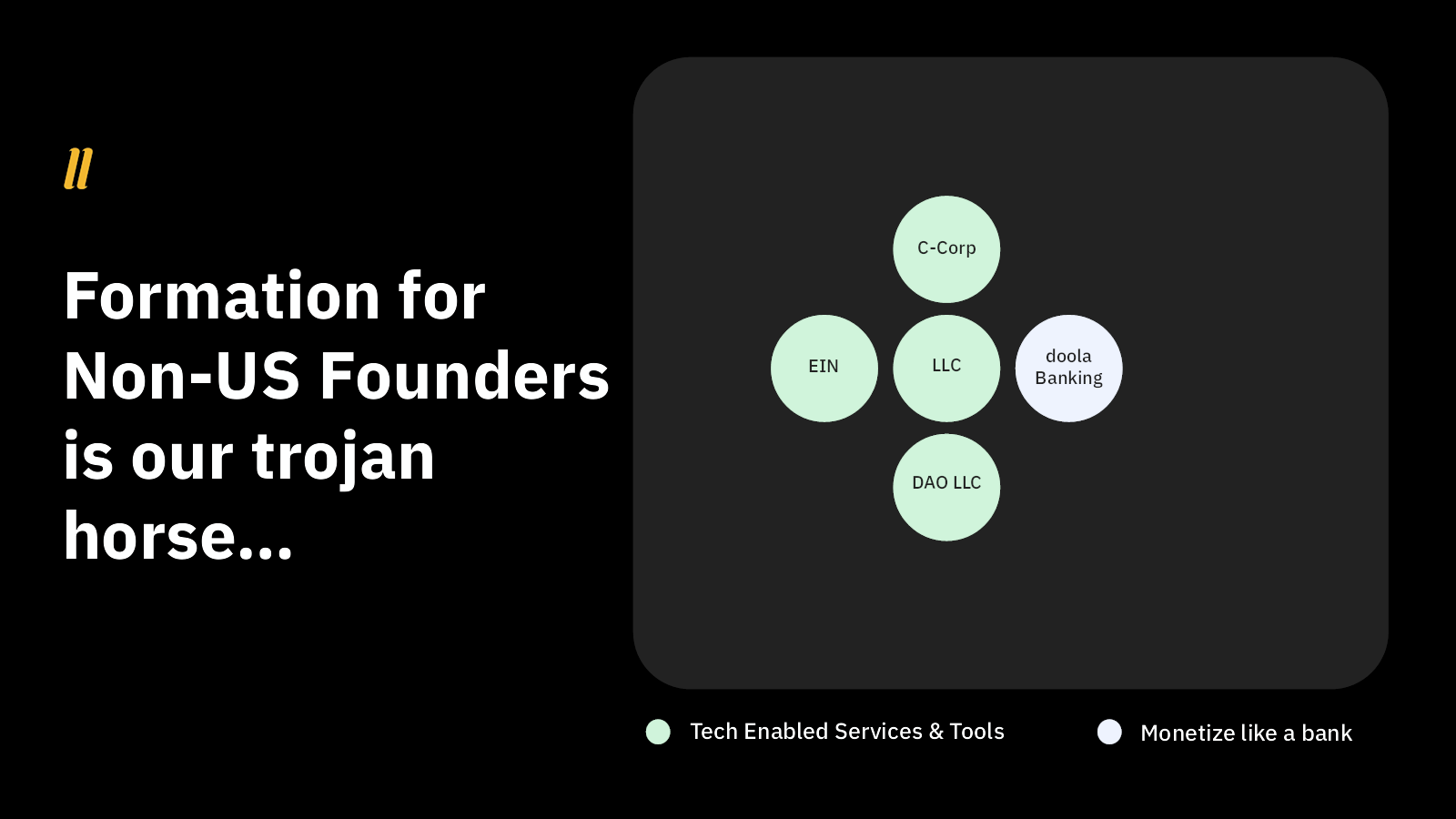
- Strategy slide
- Product portfolio slide
- Market size slide
- How it works slide
- U.S. market opportunity slide
- Global market opportunity slide
- Vision slide
- Team slide (?)
- Contact slide
Three things to love
To be frank, I can tell from just looking at the list above that there’s a lot of information missing from the deck. In fact, my AI deck-review tool estimates there’s only a 15% chance of Doola successfully raising capital with this deck alone. We’ll get to that later, but let’s first focus on what Doola got right, because it does do some things incredibly well:
Great use of a combination slide
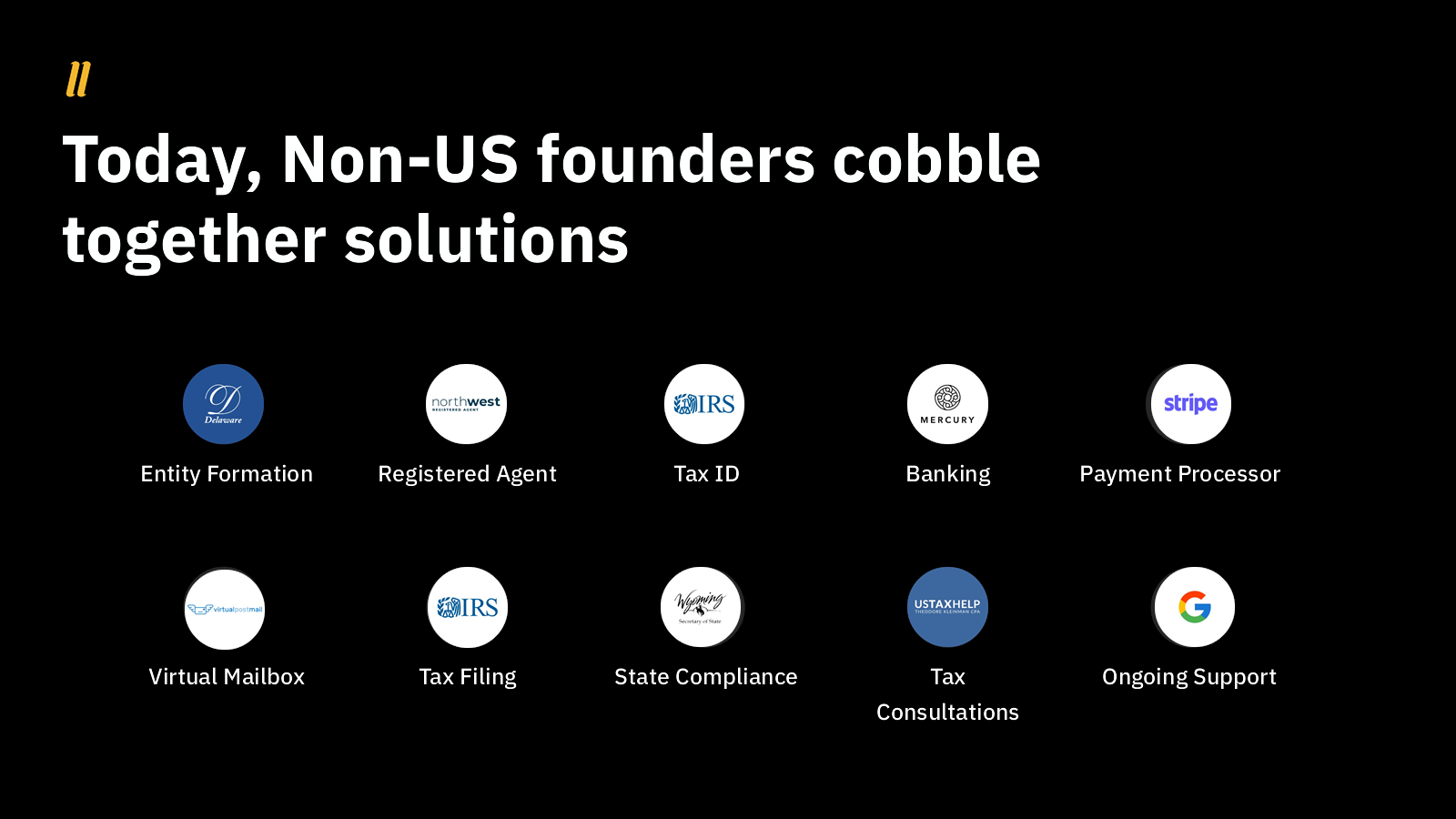
I love using two slides that work together to tell a compelling story. Doola uses slides 6 and 7 to great effect:

[Slide 6] The setup . . . Image Credits: Doola

[Slide 7] . . . and what a payoff! Image Credits: Doola
This is quite the effective way to build toward explaining the business model indirectly. It also sets the stage for explaining the business model and monetization plans over time.
A subtle and elegant problem statement
This is a perfect example of a company that knows its audience. The slide lays out a bunch of problems, but Doola knows it is talking to investors, and so it resists the temptation to explain each problem. Investors are painfully aware of many of these issues and how they show up for startups.

[Slide 3] Understated problem statement — it’s a bit of a gamble, but it works here. Image Credits: Doola
Simplifying things is always a gamble, but in this case, I believe Doola won the bet. Yes, these are complex, frustrating and expensive problems, which makes them definitely worth solving!
Interesting bottom-up approach to size up the market

[Slide 10] It’s interesting, but is it a good idea? Image Credits: Doola
Most startups have a decent amount of success with the top-down approach for estimating their market’s size (using the TAM/SAM/SOM model). But it’s interesting to see Doola take a different tack to arrive at a potential market size of $4.5 billion per year. As I’ve written before, great founders often have to turn to a bottom-up approach to market sizing, because there’s nothing else like what they are building out there.
I’m not sure if that’s the right approach here given that this space does have a few competitors, but I do enjoy the clarity of this slide.
As I mentioned earlier, there’s a vast amount of information missing from this pitch deck. So much, in fact, that it is essentially useless as a traditional pitch deck. I suspect that Doola was already talking to HubSpot Ventures as part of its original round and that something encouraged HubSpot to write a check anyway — maybe the investor had already made up their mind before they saw this deck.
In the rest of this teardown, we’ll look at three things Doola could have improved or done differently, along with its full pitch deck!


