Reddit refreshes its logo as IPO speculation swirls | TechCrunch
If you weren’t already buying the Reddit IPO rumors, the internet’s beating heart of deeply niche microcultures just introduced a rebrand, refreshing its iconic logo and rolling out some new visual vibes.
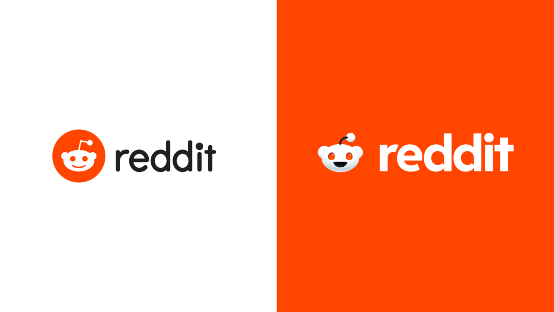
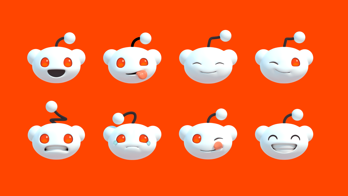
Reddit’s most obvious visual update is a new design for Snoo, the anthropomorphic red and white robot mascot synonymous with Reddit since its earliest days.

Image Credits: Reddit
Compared to the now-ancient initial version of Snoo, the new Snoo looks very slick. The new mascot replaces the flat design of the previous Snoo with a three dimensional version of the character that could look at home in a Pixar movie. Snoo, who is genderless, also scored opposable thumbs in the redesign process along with an open-mouthed smile.
The new logo — a disembodied Snoo head in a red chat bubble — is already live as the logo and favicon on Reddit’s corporate website. We’re starting to see the new logo on Reddit.com as well, along with some wonky behavior like broken comments. (TechCrunch has reached out to the company to ask if the issues are related to the rebrand’s rollout.)
Reddit co-founder Alexis Ohanian a.k.a. /u/kn0thing originally created Snoo as sketch while he was still in college at the University of Virginia. (Ohanian, who previously served as Reddit CEO, stepped down from the company’s board of directors three years ago to open the board up to more racial diversity.)
Beyond the Snoo glowup, Reddit is also refreshing its typefaces with a new original set of fonts meant to evoke chat bubbles, a visual hint at Reddit’s self-styled identity as a place for “conversations.” One of the typefaces, Reddit Sans, will be open source and widely available online.
“As we expand our global presence into new markets and engage with more audiences from advertisers and developers to redditors and moderators, we need to strengthen our brand foundation to allow for more creative and consistent expression,” Reddit Chief Marketing and Consumer Experience Officer Roxy Young said. “Our goal remains to focus on redditors’ needs and make it simpler to bring community, belonging, and empowerment to everyone in the world.”
The company is also expanding its color horizons beyond the classic reddish orange (apparently known as OrangeRed) that Reddit is known for. A suite of new colors known as GuavaPink, LimeGreen, BananaYellow, and JuniperBlue will pop up in designs, bringing more color into the platform and its apps.
The timing might not be a coincidence. It’s easy to forget that Reddit, a longtime useful corner of the social internet isn’t already a public company like many of its peers. Reddit endured a rocky 2023 after waging war with its own developer community, a protracted fight that saw many subreddits — Reddit’s core interest-based communities — go dark in protest.
Now that the drama has cooled off, Bloomberg reports that Reddit may be on track for an IPO that could land as soon as the first quarter of 2024. The company’s interest in going public has been bubbling up for years now so take that with a grain of salt, but a conspicuously-timed brand refresh certainly hints that big news for Reddit could be right around the corner.


