Pitch Deck Teardown: Equals’ $16M Series A deck | TechCrunch
It’s a rare startup that tears down its own pitch deck, but that’s exactly what Equals did after it raised a $16 million Series A round. Equals’ mission is not to replace the spreadsheet, but to ensure that a spreadsheet can do whatever its users throw at it. As an inveterate spreadsheet user, this is an approach that I can get behind — I’ve built entire software solutions with extremely complex spreadsheets as the back end.
Furthermore, as a pitch deck connoisseur, I can also get behind the bright and bold design of Equals’ deck.
I particularly enjoyed a take I’ve not often seen in deck design, which is breaking down the deck into two different sections: a pitch deck and a data deck. The latter provides a breakdown of the company’s financials over seven slides, showing ARR, lead-to-customer conversion rates, churn, and other figures. It’s a good idea: I often advise startups to tell the story with words, then tell the same story with numbers.
Let’s see what else there is to love about this deck.
We’re looking for more unique pitch decks to tear down, so if you want to submit your own, here’s how you can do that.
Slides in this deck
Figures from the two traction slides were redacted, and there is a lot of (redacted) data in a separate data deck. There are no market size and go-to-market slides either, but we’ll get to that later.
- Cover slide
- Opening statement
- Mission slide
- Problem slide
- Solution/mission slide
- Product (“Meet Equals”)
- Product demo slide
- Product validation slide
- Traction slide
- Traction 2 slide
- Product highlights slide
- Product roadmap slide
- Team slide
- Ask and use of funds slide
- Closing slide
Three things to love
I’ve already given Equals kudos for the design, but this deck is striking enough that it’s worth mentioning again: This is a good-looking deck. Here are a few other things that stood out to me:
Making it real
For a while, it’s seemed as if the easiest way to build a successful software startup was to find something people use Excel for, then build a tool that’s better, more focused and easier to use. That’s worked well for countless businesses, so it’s a bold undertaking to take on Excel at its home turf, by replacing a spreadsheet with . . . a spreadsheet. Airtable has had some success in this space, so one of the first things that springs to mind is whether there is room for another company in this vertical.
Equals makes a comprehensive and compelling argument for a resounding yes to that question by listing out a number of use cases for its software:

[Slide 4] Here’s a problem slide for you . . . Image Credits: Equals
The problem seems real enough, but it seems largely to do with the provenance of data and data analysis/algorithms. And sure, Excel files can be challenging, but Excel itself has a relatively robust online solution as well now (so the statement “Excel has not” feels slightly hyperbolic). We also have Google Sheets, Airtable and a ton of other potential competitors in the space.
Still, in the dry and boring world of spreadsheets, this is probably the most fun way to outline the problem you’re trying to solve. I like it!
So it’s Excel, but more online

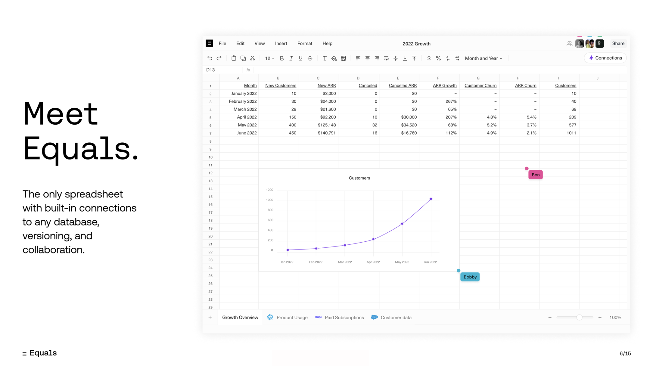
[Slide 6] Here’s where the magic happens. Image Credits: Equals
Founders, especially technical founders, often face a tremendous challenge when trying to explain what their startup does in simple terms. I’m really impressed that Equals’ team managed to distill the product down to something this simple: Spreadsheets, but with database connections and collaboration. That very simple statement hides a lot of technical complexity and what must have been an absolute nightmare of an integration challenge.
But hiding the complexity is a great idea: The end users don’t want to know why their spreadsheet won’t connect to the Stripe data source. They just need it to work.
Quite elegant. Very well done.
That’s how you map a path to the future!

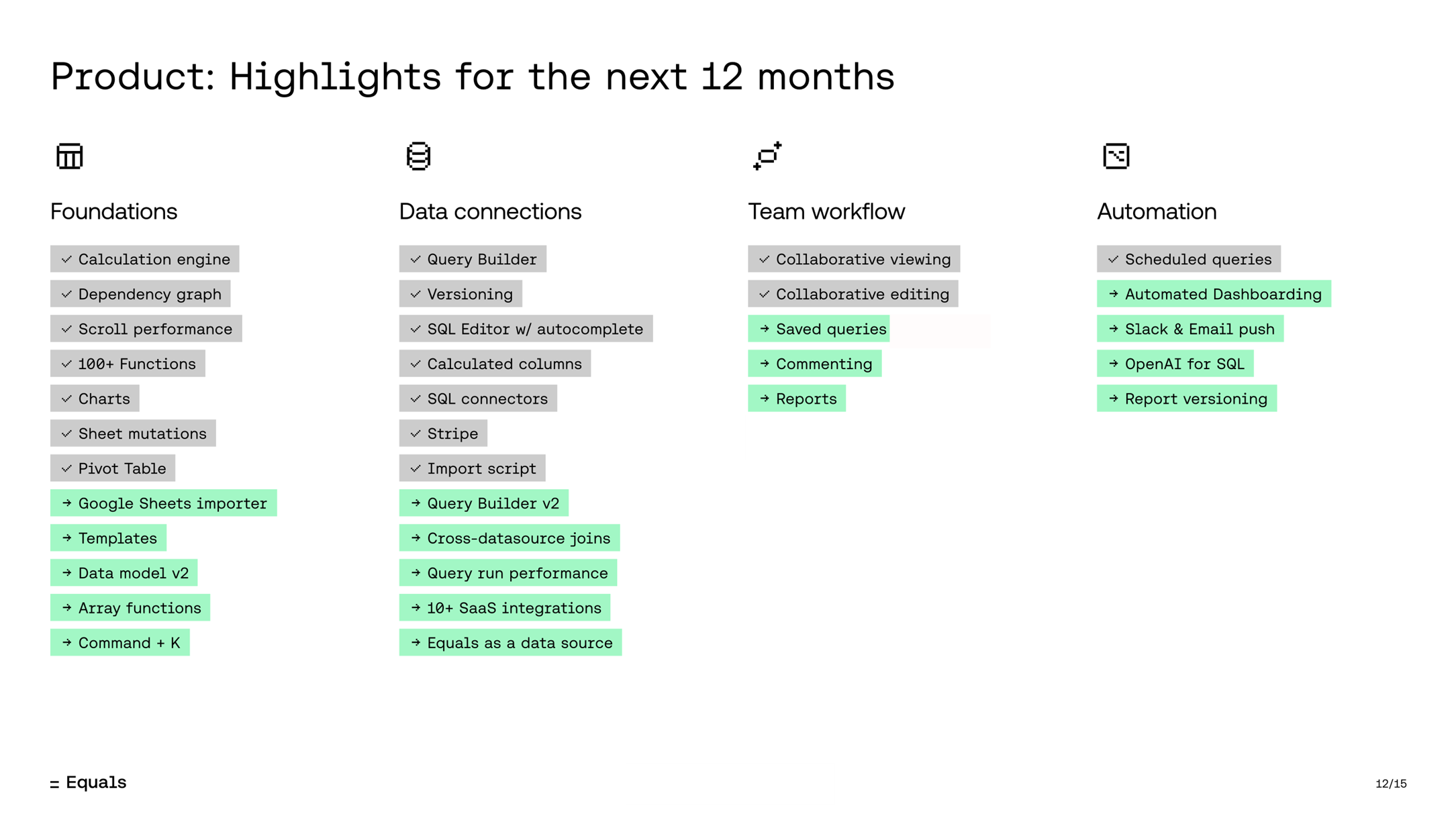
[Slide 12] Such a great way to map your near future. Image Credits: Equals
Investors rarely care about this level of granularity in your product roadmap, but they’re not uncurious, you know? This is a great rough overview of what you care about and doesn’t go into the weeds about the nuts and bolts of what the engineering team will be building.
Even though this plan is pretty technical, I’m impressed by the team’s ability to resist the temptation to go into too much here. I’ve no idea what they’re going to link Command + K to, but it doesn’t really matter — this is a great top-level view that will let you have a board-level conversation about the product priorities for the next year.
I’ve no idea what they’re going to link Command + K to, but it doesn’t really matter.
Equals has also done something clever with the preceding slide: Slide 11 shows the features that have already been built, which then allows the narrative to flow evenly to this slide (with the existing features now highlighted in gray). This lets you have a two-step conversation about the product: Talk about everything you’ve built, then talk about everything you’re going to build and how that helps the product become more relevant to your target audience — and maybe expand the potential user base as well.
As a startup, you can learn from this slide that you should not spend too much time on your product. These two slides are a great example of how you can sidestep that problem with finesse.
In the rest of this teardown, we’ll take a look at three things Equals could have improved or done differently, along with its full pitch deck!
Three things that could be improved
It’s not all rainbows and unicorns in Equals’ deck . . .
Be mindful of your audience
A pretty common problem with pitch decks is that it’s sometimes hard to tell whether the founders understand who they are talking to. Check out this testimonials slide:

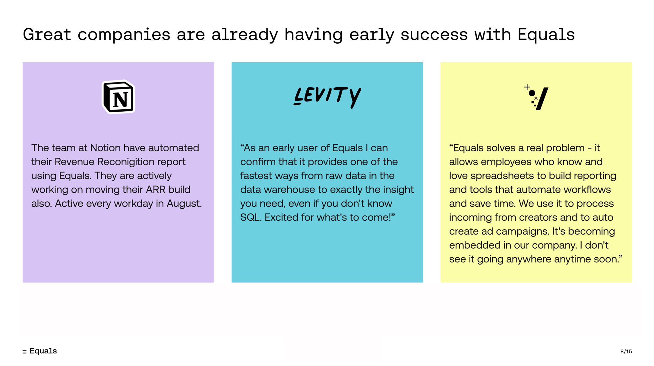
[Slide 8] Yeah, but do the investors care? Image Credits: Equals
I have no doubt that this is a powerful slide to use in the company’s sales operation when talking to new clients. But I’m not sure how effective it is as part of an investment pitch.
I can see several issues here:
- I don’t know what any of those logos are. Okay fine, I recognized Notion, but I have no idea what Levity is or does, and I don’t recognize the V logo. That means that two of the three logos on this slide aren’t helping convince me to invest. So why use them?
- Two quotes and one unaccredited set of statements don’t really serve as a particularly strong set of testimonials.
- In the final testimonial, the line “I don’t see it going anywhere anytime soon” can be easily misconstrued. I’m assuming the person meant that their product is here to stay, but that’s not 100% clear from the quote.
- It’s poor form to have quotes without properly attributing them to someone. Who said these nice things? If it were the CTO of a company, you should definitely highlight that. Think about it this way: If you attribute “This is a really good product” to “an Apple employee,” would that be a good thing? If Tim Cook said it, that’d be pretty great. If some random sales flunky in an Apple Store said it . . . you know what I’m getting at.
Overall, this slide seems neutral at best — at least when it comes to convincing an investor to invest. So it’s probably safe to just leave it out of the deck altogether.
So . . . how big is this market?
Perhaps I’m picking at nits here. Ask any investor, “If I can steal 30% of Excel’s business, is the market big enough?” and you’ll probably get a resounding yes.
The thing is, this deck is also missing a go-to-market slide. That means Equals is missing out on two opportunities to tell investors how it is thinking about its market. Who are the customers? How many of them are there? What is the value prop? How do you reach these customers? How do you convince them to stay? You’ll need to answer that cadre of questions to successfully raise money — and it’s a little thin on the ground in this deck.
What are the goals, though?!

[Slide 14] Erm, sure, but this is way too vague. Image Credits: Equals
Investors are not looking for a ballpark figure or a vague plan when it comes to how your startup will use the funds raised. A well-crafted “use of funds” slide does more than just list expenses; it builds trust. By being transparent about your financial needs and how they align with your business goals, you’re showing potential investors that you’re not just another startup looking to burn cash. No, instead, you’re a serious entrepreneur with a plan for growth and a clear vision for the future.
I know many founders stumble on this critical slide. Glamorous but unnecessary expenses, a nebulous abyss of “miscellaneous” costs, and vague descriptions of how the funds will be used are just a few common pitfalls that can turn investors away. Equals falls prey to such a trap: None of these goals are nearly specific enough. The slide should be as clear and detailed as possible, avoid generalizations, and focus on specific, measurable, achievable, relevant and time-bound (SMART) goals.
- “Scale marketing”: Sure, but to what?
- “Scale success”: Yes, but what’s the goal? How do you know you’re successful?
- “Accelerate pace”: Well, yes, but if you wrote 10 new pieces before the fundraising and managed 11 afterward, you’ve hit that goal.
Be specific. Use your “use of funds” slide well. This is not the time for abstraction, but for bold, specific, quantified audacity. This slide is where you spell out your vision in dollars and cents, and if you do it correctly, it’s where investors will begin to see their futures aligning with yours.
Crucially, a well-designed “use of funds” slide helps paint the picture for your next funding round. If you hit all the goals, can you raise the Series B? Great! Does your plan set you up for success? Fantastic!
This slide is almost useless, which is such a shame. Greater precision here would make fundraising so much easier.
The full pitch deck
If you want your own pitch deck teardown featured on TechCrunch, here’s more information. Also, check out all our Pitch Deck Teardowns all collected in one handy place for you!


