Instagram chases TikTok with a new full-screen feed – TechCrunch
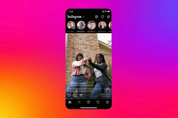
Instagram announced today it will begin testing a new version of its full-screen feed, similar to TikTok’s, which aims to improve upon the way photos appear in this new format. The company said it will also use this experiment to try out changes to the navigation bar at the bottom of the Instagram app, where it will soon add shortcuts for creating a post and accessing messages.
As you may recall, Instagram had somewhat controversially relocated its Compose button back in 2020 when it gave the prime spot in the center of the navigation bar to Reels. The Compose button was then tucked away in the top-right corner of the app. The choice may have benefited Instagram by driving users to Reels — if only by accident, in some cases — but it may have disincentivized users from creating a quick post. The fact that Instagram says it will now test bringing the button back to the navigation bar could signal that it’s seeing a decline in new content creation as more people shift their time and energy to TikTok.
As for the full-screen feed, Instagram had begun a similar experiment in May where it was soon met with user complaints and negative feedback. In addition to hiding away captions and comments, the updated format displayed all content in a 9:16 aspect ratio — including Instagram’s classic square photos and horizontal images. For those photos that didn’t properly fit the feed, Instagram applied a blurred, gradient border to make them blend in. Needless to say, many Instagram users were not fond of this change — and explained why in their replies to Instagram head Adam Mosseri’s posts about the update.
Another issue with the earlier test was how the feed included odd white space in between posts. This made the feed appear to be something of a cross between TikTok’s true full-screen feed and a more traditional, card-style feed where posts were separated. Users also said the new format made their feed seem more cluttered as a result. Instagram has now clarified to TechCrunch that the new full-screen feed test rolling out will no longer show white space on the top and bottom of posts when viewing 9:16 videos.
However, the new feed holds some promise for creators, as Instagram said it would begin recommending their content to users who don’t follow them — similar to how TikTok throws in content it thinks you might like on its For You page. It’s also arguably helpful to professional creators and advertisers when different apps standardize around one format, as it allows content to more easily be reused across platforms.
The changes were announced on Instagram by Meta CEO Mark Zuckerberg, who expressed that “photos are still an important part of Instagram” — a comment meant to address the backlash from those who use Instagram primarily for photography and who now believe Instagram no longer values their contributions amid its desperation to clone TikTok and shift users to video.
Zuckerberg’s post also said Instagram was working on ways to improve the way photos showed up in this full-screen feed and some users would see the test come to the app soon. He didn’t elaborate on what, specifically, Instagram was doing to address users’ concerns.
The changes to the navigation bar were not mentioned in his post, nor displayed in the images Instagram provided (shown above). But a spokesperson noted them in response to an inquiry about how this test differed from the one that had arrived in May.


